July 31, 2026 · 12 min read
App Store screenshot examples: what 99 top listings do
We measured 99 top-charting listings and 679 screenshot files. Most upload at the older 6.5-inch size, and games put their captions where apps don't.
Seventy of 99 top-charting US App Store listings upload their screenshots at the 6.5" display class, not the 6.9" class that matches every current large iPhone. That isn't sloppiness. It's the size Apple's own requirement line names, and the top charts have quietly settled on it.
We read 49 apps and 50 games from Apple's US top-free charts on 22 August 2026 and pulled the dimensions of all 679 iPhone screenshot files out of each listing's own page data. Then we looked at every first screenshot by hand. The results below correct three things this post claimed when it ran in July off a sample of ten.
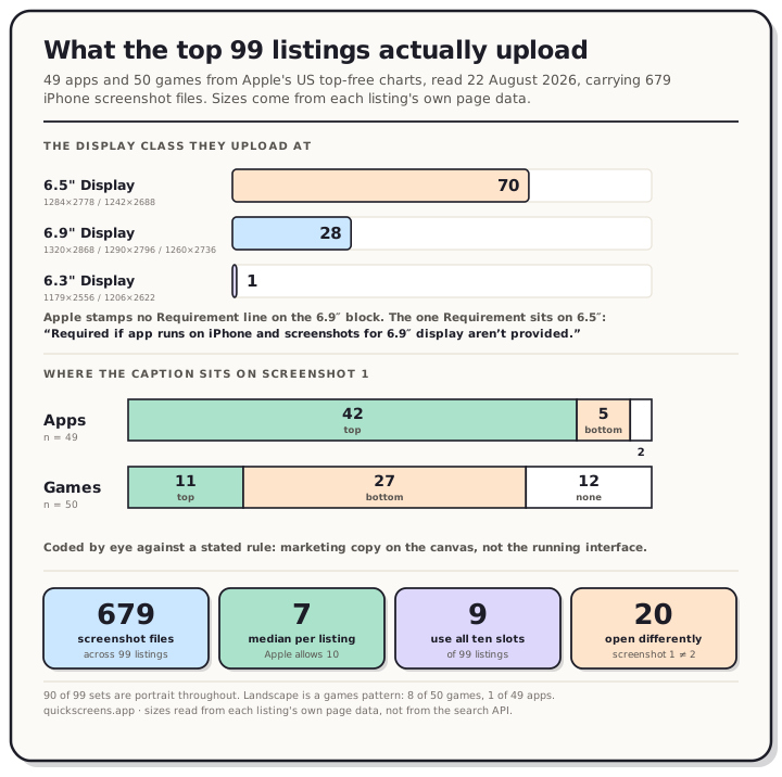
Read the chart description
Measured on 22 August 2026 across 99 top-charting United States App Store listings, 49 apps and 50 games, carrying 679 iPhone screenshot files between them. Panel one, the display class each listing uploads at: 70 listings upload at the 6.5 inch class, either 1284 by 2778 or 1242 by 2688 pixels; 28 upload at the 6.9 inch class of 1320 by 2868, 1290 by 2796 or 1260 by 2736; and 1 uploads at the 6.3 inch class. No listing mixes classes within its set. Apple stamps no requirement line on the 6.9 inch block at all. The requirement sits on the 6.5 inch block and reads, required if app runs on iPhone and screenshots for 6.9 inch display are not provided. Panel two, where the marketing caption sits on the first screenshot, and apps and games invert. Of 49 apps, 42 put the caption at the top, 5 at the bottom and 2 carry none. Of 50 games, only 11 put it at the top, 27 put it at the bottom and 12 carry none. Panel three, four counts: 679 screenshot files across the 99 listings; a median of 7 screenshots per listing against Apple's limit of 10; 9 listings use all ten slots; and 20 listings give the first screenshot a visibly different template from the second, which is far fewer than this post originally claimed from a sample of ten.
How we measured
Two feeds, both read on 22 August 2026: the 50 entries in Apple's Top Free Apps feed and the 50 in the US games chart. For each listing we opened the product page on apps.apple.com and read the iPhone media shelf out of the page's own embedded data, which is where the upload dimensions live. One app, X, failed to return a page on repeated attempts and is absent, so the sample is 99 rather than 100.
Dimensions, counts and orientation come straight out of that data, so they're exact. Caption placement and the first-versus-second comparison were coded by eye from the images themselves, one rater, against rules stated below.
We tried to automate the caption work and threw the result away. A pixel signature that compared screenshot one against the rest of its set flagged ChatGPT as one of the strongest outliers in the sample. Looking at the actual set, all eight of ChatGPT's screenshots use the same caption-on-top template and the same white device frame, and the metric was really responding to a warmer background on the first image. It measured tone, not intent, so it isn't in this post. That's the same trap our localization measurement hit when a different asset id turned out not to mean translated artwork.
We used Apple's public search API only to resolve listings, never to read screenshot sets, because that API serves a different set from the product page.
Most of the top charts are still on the older size
Here's the split by the class each listing uploads at:
| Display class | Accepted sizes | Listings | Apps | Games |
|---|---|---|---|---|
| 6.5" | 1284 × 2778, 1242 × 2688 | 70 | 37 | 33 |
| 6.9" | 1320 × 2868, 1290 × 2796, 1260 × 2736 | 28 | 11 | 17 |
| 6.3" | 1179 × 2556, 1206 × 2622 | 1 | 1 | 0 |
Not one listing in the 99 mixes classes inside its own set. Whatever size a team picks, every file in the shelf matches it, which is the single most consistent behaviour in the whole sample.
The single most common file size is 1242 × 2688, which accounts for 301 of the 679 files on its own. That's the iPhone 11 Pro Max era size.
It's worth being precise about why this is fine, because it looks wrong at first glance. On Apple's screenshot specifications page, read the same day, the 6.9" block carries no Requirement line and no Note at all. It's just a device list and three accepted sizes. The Requirement sits on the 6.5" block instead: "Required if app runs on iPhone and screenshots for 6.9" display aren't provided." So a 6.5" upload satisfies the rule by itself, and 70 listings take that route.
What Apple's page does not say is what fills the 6.9" slot when you only provide 6.5". The only Note about scaling runs the other way: "If screenshots with the accepted sizes aren't provided, scaled screenshots for 6.9" displays are used." We haven't tested the reverse and won't guess at it.
For most people the practical answer is that this decision matters less than it sounds, because the store draws a 1,320-pixel upload at about 220 CSS pixels on a desktop product page and smaller than that on mobile web. Our App Store screenshot sizes reference lists every accepted size per class if you want to pick deliberately.
Nobody fills all ten slots
Apple accepts up to 10 screenshots. The median listing uploads 7.
| Apps | Games | All | |
|---|---|---|---|
| Median | 7 | 6 | 7 |
| Fewest seen | 4 | 4 | 4 |
| Using all 10 | 7 of 49 | 2 of 50 | 9 of 99 |
| Using 5 or fewer | 9 of 49 | 16 of 50 | 25 of 99 |
Nine listings in 99 use the full ten. Twenty-five stop at five or fewer, and games are most of those. If you've been treating ten as the target, the top charts disagree with you.
That doesn't make seven correct. It makes ten optional, which is a different and more useful thing to know when you're deciding how much work to commission.
Apps put the caption on top. Games mostly don't.
This is the finding that changed most when the sample grew, and it's the one the original ten-listing version of this post couldn't have seen, because it contained no games at all.
Counting the marketing caption on each first screenshot, where "marketing caption" means text on the canvas that talks about the app rather than text belonging to the running interface:
| Caption on top | Caption at bottom | No caption | |
|---|---|---|---|
| Apps (49) | 42 | 5 | 2 |
| Games (50) | 11 | 27 | 12 |
Apps behave the way the July sample suggested. Forty-two of 49 put the caption above the artwork, and that held across Google Maps, Telegram, WhatsApp, Gmail, Facebook, Outlook, Venmo, Cash App and most of the rest of the chart.
Games invert it. Twenty-seven of 50 drop the caption into a band across the bottom, usually two or three loud words on a coloured plate: "SORT WATER!", "CHALLENGE YOURSELF!", "No Timer!", "EPIC WIN". Another 12 use no marketing caption at all and just show the game.
The reason is structural rather than stylistic. A utility app's screenshot is a screenshot of an interface, and interfaces have their own text near the top, so a caption there needs its own clear band. A game's frame is artwork with a heads-up display already sitting along the top edge, so the bottom is the empty part. Both groups are putting the caption where the underlying image has room.
If you make a game and you've been following advice written from a sample of productivity apps, that's worth knowing. The convention you're copying isn't the convention your category uses.
The first screenshot usually isn't special
The July version of this post said seven of ten listings give the first screenshot a different job from the rest. Measured across 99 listings, using the rule "does screenshot one use a visibly different template from screenshot two", it's 20.
Thirteen of 49 apps and 7 of 50 games. The ones that do it fall into two groups. Apps tend to add a brand lockup: Gmail opens with its logo and a claim rather than a feature caption, Spotify and Capital One do the same, TikTok opens on a plain brand card with no product UI at all. Games tend to open with a title card, and MONOPOLY GO!, Candy Crush Saga, Call of Duty Mobile, Pokémon GO and Coin Master all lead with logo art before any gameplay caption appears.
So the pattern is real, it's just a minority pattern. Roughly one listing in five opens differently, and four in five run the same template from the first image to the last.
That reframes the advice. A branded opener is a legitimate choice rather than the thing everyone does, and if you spend your first slot on a logo you're spending the slot Apple says is most likely to appear in search. Apple's wording is that "depending on the orientation of your screenshots, the first one to three images will appear in search results when no app preview is available", which carries three qualifiers worth reading slowly: one to three rather than always three, dependent on orientation, and conditional on having no preview video. Only about a quarter of top listings carry a preview, so for most apps that clause is live. We covered what the first three actually have to survive separately.
Portrait, unless you're a game
Ninety of the 99 sets are portrait the whole way through. Eight are landscape throughout and one mixes.
All but one of the landscape listings are games: Fortnite, Among Us!, 8 Ball Pool, Call of Duty Mobile, Castle Busters, Grand Fortune Club, Bruno Reels Casino and Jewel Coloring. The single non-game is Netflix Game Controller, which is a game accessory. Jewel Coloring is the one set in 99 that mixes, running five portrait files and then five landscape.
For anything that isn't a game rendered in landscape, portrait is effectively the whole field.
What changed since July
This post first ran on 31 July 2026 off ten listings read in one sitting. Three of its claims don't survive the bigger sample, and we'd rather say so than quietly restate them.
"All ten sets are portrait" became "90 of 99, and landscape is a games pattern". "Nine of ten put the caption on top" is right for apps and backwards for games. "Seven of ten give the first screenshot a different job" became 20 of 99.
The per-app observations aged too. In July we recorded Instagram opening with a plain, uncaptioned screenshot. The set on its listing today runs a caption above the artwork on every image, same as the rest of the chart. We're describing what the product page served on two dates, not what anyone did in App Store Connect, but it's a reminder that listings change more often than people expect and that any teardown is a photograph rather than a rule.
What this sample doesn't prove
It shows what the top of the US charts has converged on, on one day. It doesn't show that any of it caused the ranking. We have no conversion data, neither store publishes any by screenshot style, and we ran no test. Big apps also get installs on brand recognition alone, so they can afford choices that would sink an unknown app.
The by-eye half is one person's coding against a stated rule, and the honest edge case is games, where a banner can read as gameplay UI or as marketing copy depending on how you squint. The dimension and count numbers have no such wobble: they come straight out of the listing data.
Top-free charts also skew. Free games dominate the games half, so casual puzzle titles are heavily represented and premium games are barely there.
Treat all of it as defaults you need a reason to break, not as rules.
Frequently asked questions
What size should App Store screenshots be? 1320 × 2868 covers the current 6.9" class, and it's the size a modern iPhone simulator writes. But 70 of the 99 top listings we measured upload at the 6.5" class instead, either 1284 × 2778 or 1242 × 2688, which Apple's requirement line explicitly allows when you provide no 6.9" set. Both routes are legal. Pick one and use it for the whole set, which is what all 99 listings do.
How many App Store screenshots should I upload? Apple takes up to 10. The median in our sample is 7, only 9 of 99 listings use all ten, and 25 stop at five or fewer. Ten is a ceiling, not a target.
Where should the caption go on an App Store screenshot? Above the artwork if you're an app: 42 of 49 apps in our sample do that. Below it if you're a game: 27 of 50 games do that, and another 12 use no caption at all. The difference tracks where the underlying image has empty space.
Should my first screenshot be different from the others? About one in five top listings does it, so it's a real option rather than a default. Bear in mind that Apple says the first one to three images can appear in search results when you have no preview video, so a logo card spends your most visible slot on branding.
Do App Store screenshots need a device frame? No. Apple doesn't require one, and plenty of top listings skip it, games especially. If you use one, note that Apple's marketing guidelines are strict about depicting Apple hardware, which we covered in the device mockup post.
Portrait or landscape? Portrait for apps. In our sample 90 of 99 sets are portrait throughout, and 8 of the 9 landscape sets are games.
Do the same rules apply on Google Play? No, and the differences are sharp. Play's search card shows the feature graphic rather than a screenshot, and Play publishes its own size and count rules on our Play reference page. If you're shipping to both, treat them as two sets of constraints that happen to share artwork.
How do I capture the screenshots in the first place? The simulator route is the fastest for iOS, and it has one trap worth knowing about before you upload: the capture carries an alpha channel that both stores reject. Our step-by-step guide covers the whole pipeline, and the rules post covers what each store actually enforces.
Ready to build your set? Open the editor, pick a caption position, and export every App Store and Play Store size from one project. One-time $25, no subscription.