July 18, 2026 · 12 min read
How to make App Store and Play Store screenshots
The whole job in five steps, with the measurement behind each: the two canvas sizes that cover Apple, the caption size that survives, the alpha to strip.
Making store screenshots is five steps. Pick the canvas size, capture your app, write a caption sized for how small the store actually draws it, frame and export flattened, then make Play's feature graphic. Two canvas sizes cover Apple's entire listing and one covers Play's.
That's the whole job. What follows is the number behind each step, because every one of them has a place where the obvious approach quietly produces the wrong file. Each number here is one we measured ourselves, on the date marked next to it.
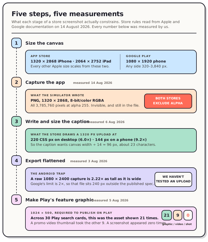
Read the chart description
A five-step pipeline for producing App Store and Google Play screenshots, with the measured constraint at each step. Step one, size: Apple requires 1320 by 2868 for the 6.9-inch iPhone class and 2064 by 2752 for the 13-inch iPad class and scales every other size from those, while Google Play takes 1080 by 1920 for a phone with any side between 320 and 3,840 pixels. Step two, capture: an iPhone 17 Pro Max simulator screenshot taken on 14 August 2026 wrote an 8-bit RGBA PNG at 1320 by 2868 in which all 3,785,760 pixels sat at alpha 255, invisible transparency that both stores exclude from screenshots. Step three, caption: the App Store draws a 1320 pixel wide upload at 220 CSS pixels on a 1280 pixel desktop window and 144 pixels on a 375 pixel phone, so a caption needs roughly a fourteenth of the canvas width, about 96 pixels, which fits about 23 characters. Step four, export: flatten the alpha channel before upload, and note that a raw 1080 by 2400 phone capture is 2.22 times as tall as it is wide and therefore sits 240 pixels outside Google's rule that the long side cannot exceed twice the short side. Step five, feature graphic: 1024 by 500 and required before Play will let you publish, and across 30 Play search cards measured on 5 August 2026 it was the asset shown 21 times, with a promo video thumbnail the other 9 times and a screenshot never.
Step 1: Work out how few sizes you need
Most of the anxiety about store screenshots is about sizes, and the real list is shorter than it looks.
Apple requires one iPhone size and, if your app runs on iPad, one iPad size. Everything else is scaled for you.
| Store | What's required | Size |
|---|---|---|
| App Store, iPhone | 6.9-inch class | 1320 × 2868 (or 1290 × 2796, 1260 × 2736) |
| App Store, iPad | 13-inch class, iPad apps only | 2064 × 2752 (or 2048 × 2732) |
| Google Play, phone | 2 screenshots across device types | 1080 × 1920 portrait (320–3,840 px per side allowed) |
| Google Play | Feature graphic, required to publish | 1024 × 500 |
| Google Play | Icon, required to publish | 512 × 512 |
Apple's scaling is a chain. The 12.9-inch slot scales from your 13-inch set, 10.5-inch scales from 12.9-inch, and 9.7-inch scales from 10.5-inch. You supply the top link and Apple fills the rest. We checked that against 19 real iPad listings and not one of them uploaded a smaller iPad class.
Play works differently. It checks ranges rather than exact sizes: 320 to 3,840 pixels per side, with the long side no more than twice the short side. Full tables for both stores are on our App Store screenshot sizes and Google Play screenshot sizes references. The requirements were re-verified against Apple's current screenshot specifications and Google Play's current preview-asset requirements on 25 August 2026.
Step 2: Capture, and know what your capture tool writes
Capture from a simulator, an emulator or a real device. Use realistic data. An empty state reads as unfinished, and a screen with believable content reads as an app people already use.
The part nobody mentions is what the file contains. We captured an iPhone 17 Pro Max simulator on 14 August 2026 and measured it:
$ file default.png
default.png: PNG image data, 1320 x 2868, 8-bit/color RGBA, non-interlaced

$ sips -g hasAlpha default.png
  hasAlpha: yes
That's an alpha channel, and both stores exclude alpha from screenshots. Apple's specification says images can't include alpha channels or transparencies. Google asks for JPEG or 24-bit PNG with no alpha.
The transparency is invisible. We extracted the alpha channel and every one of the 3,785,760 pixels sat at 255, fully opaque, in a single histogram bucket. The image looks fine in Preview, in Finder, and in any tool you'd think to check it with. The channel is still there.
This isn't specific to Apple's tooling. We've now measured it on the iOS simulator, in a React Native and Expo build, on three Android emulators, and on eleven iPad simulators. Every default capture carried it.
Two flags avoid it at capture time on iOS:
xcrun simctl io booted screenshot --type=jpeg shot-01.jpg
xcrun simctl io booted screenshot --mask=black shot-01.png
Both wrote three-channel files in our run, components 3 for the JPEG and 8-bit/color RGB for the masked PNG. Avoid --mask=alpha, which puts genuinely transparent pixels in the rounded corners.
If you already have the files, strip it after the fact:
magick shot-01.png -alpha remove -alpha off -define png:color-type=2 clean.png
That produced 8-bit/color RGB and hasAlpha: no when we ran it today.
There's a second Android-only trap here. Two of the three emulator captures we measured were outside Google's two-times rule: 1080 × 2400 is 2.22 times as tall as it is wide, so it sits 240 pixels over, and 1280 × 2856 sits 296 pixels over. That's a property of modern phone aspect ratios rather than of the emulator, so real devices produce it too. We haven't tested an upload and won't predict a rejection. We can only say the file falls outside the published spec.
Which screens, and in what order
Here's where most advice, including the version of this post we published in July, gets confident without evidence. We don't have conversion data for screenshot ordering and we're not going to invent any.
What we can tell you is Apple's own wording: the first one to three images appear in search results, the count depends on their orientation, and it happens only when the listing has no app preview video. A preview takes that slot instead. So "the first screenshot is the only one anyone sees" is conditional, not a rule. On Play it isn't true at all, for reasons that land in step 5.
So order your set with the strongest screen first. It's cheap, and it's the right call on Apple when there's no preview video. Just don't let it become the only thing you optimise. For the screens themselves, pick moments rather than pages: the core value, not the login screen.
Step 3: Size the caption for 220 pixels, not for your monitor
A caption should make one claim a stranger understands instantly. Write the benefit rather than the feature: "Never lose your work" over "Automatic backups."
The size question has a measured answer. We opened App Store product pages and measured the box a screenshot lands in.
| Viewport | Screenshot renders at | Reduction |
|---|---|---|
| 375 px phone | 144 × 312 | 9.2× |
| 1280 px desktop | 220 × 476 | 6.0× |
| 1440 px desktop | 260 × 563 | 5.1× |
You upload 1320 pixels of width and the desktop page draws 220. The box is Apple's layout, not yours: three apps with three different upload sizes all rendered at exactly 220 × 476.3 on a 1280-pixel window.
That gives a rule you can apply in any tool. Make the caption roughly a fourteenth of your canvas width, which is about 96 pixels on a 1320-pixel canvas, and it lands at a readable 16 pixels on desktop. It buys you around 23 characters on one line. At 36 pixels the caption is a grey smear at store size. The character budget and the legibility test are worth reading before you write the copy, because it's easier to pick a short line deliberately than to discover the constraint after export.
One thing that's commonly claimed and isn't true: nothing gets cropped. The rendered box ratio matched the uploads to three decimal places, so the store scales your whole screenshot and shows all of it.
Step 4: Frame it, then export flattened
A raw capture on a white background looks like a bug report. The same capture in a device frame reads as a product, and framing gives you room for a headline.
Two rules worth knowing before you pick a frame. Apple's marketing guidelines ask you to use Apple product images as-is and name cropping, tilting and obstructing as modifications, while allowing illustrations of generic devices that carry no Apple-specific details. And App Store review guideline 2.3.10 rules out imagery of other mobile platforms in your metadata, so no Android frame in an App Store screenshot. Google goes further in one place: for Wear OS it tells you not to position screenshots inside device frames at all. We went through what a 3D pose costs you in screen area separately, and the short version is that a quarter-turn can drop the visible app UI to 56% of a flat pose.
On export, watch the format. If you design in Figma, it cannot write a store-legal PNG: their own docs say Figma supports 32-bit RGBA PNGs and that exporting without an alpha value isn't possible. Export JPEG from Figma, or strip the alpha afterwards with the command in step 2.
This is the step that fixes both capture problems at once. Composing onto a store canvas flattens the alpha channel and puts the file on a compliant aspect ratio, so the raw capture's two defects never reach either store.
Step 5: Make Play's feature graphic
The asset most likely to be missing the night before you submit. It's 1024 × 500, and Google's wording is that you must provide one to publish your store listing.
It's also, on the evidence, the most important image on a Play listing. We opened 30 Play listings across three unrelated queries and measured every search card. Not one showed a screenshot. Twenty-one showed the 1024 × 500 feature graphic and the other nine showed the promo video's thumbnail. The markup even labels them alt="Screenshot image", which is probably how the assumption survives. The full teardown is here.
So the effort you'd spend perfecting screenshot order on Apple goes into this one image on Play. We mapped where it gets cropped so you can keep the important part inside the safe area. One catch carried over from that piece: Google bans ranking, award and price claims on the feature graphic, so an award laurel that's fine on an App Store screenshot is not fine here.
The short version
- Design at 1320 × 2868 for iPhone and 2064 × 2752 for iPad. Apple scales the rest.
- Capture with realistic data, then check the file for an alpha channel.
- Size captions at about a fourteenth of the canvas width, roughly 23 characters.
- Frame it, then export flattened at every size the store accepts.
- Make the 1024 × 500 feature graphic. On Play it's the image search shows.
Frequently asked questions
What size should App Store screenshots be? 1320 × 2868 portrait covers it. That's the largest of three accepted sizes in the required 6.9-inch iPhone class, and App Store Connect scales it down for every smaller iPhone display. If your app runs on iPad, add 2064 × 2752.
Do I need a different set of screenshots for Google Play? You need different files, but not a different design. Play takes 1080 × 1920 for phones and checks ranges rather than exact sizes, so one composed set can export to both stores. Play additionally requires a 1024 × 500 feature graphic and a 512 × 512 icon before you can publish.
Can I upload a raw simulator or emulator capture? Sometimes, with two caveats. Every default capture we've measured carries an alpha channel that both specs exclude, and phone-shaped Android captures commonly break Google's rule that the long side can't exceed twice the short side. Flatten and compose them and both problems go away.
Will my screenshot get rejected if the size is wrong? We don't know, and we won't guess. Neither store publishes rejection statistics and we haven't tested a non-compliant upload. What we can tell you is which files fall outside the published specification, which is what the measurements above are for.
How many screenshots do I need? Apple takes 1 to 10 per display size per localization. Google requires a minimum of two across device types and takes up to eight per type. Google also sets a higher bar for one specific thing: to be eligible for the Play sections that recommend apps using a large screenshot format, apps need at least four screenshots at 1080px or better, and games need at least three.
Do screenshots need a device frame? No store requires one on phone listings, and Play explicitly bans them for Wear OS. Frames are a design choice. If you use one, keep it generic or use Apple's images unmodified.
Method
The simulator capture was taken on this Mac on 14 August 2026: an iPhone 17 Pro Max on the iOS 26.5 runtime, captured with xcrun simctl io <device> screenshot and measured with file, sips and ImageMagick. The alpha channel was extracted and histogrammed separately to confirm all 3,785,760 pixels sat at 255. Every command printed in this post was run before it was published.
The Apple and Google requirements were re-read from Apple's App Store Connect screenshot specifications and Google's Play preview-asset documentation on 25 August 2026, by pulling the raw HTML rather than a summary, because a summarised fetch of Apple's page has given us contradictory answers before.
The render sizes, the Play search-card tally, the Android emulator captures and the iPad simulator captures come from our own earlier measurements, each linked at the point it's used and each with its own method section.
None of these steps is hard on its own. Producing the same set at four canvas sizes, then keeping them in sync when the copy changes, is the part that eats an afternoon. In the QuickScreens editor one project exports both stores at every size they accept, alpha already stripped and the feature graphic included. One-time $25, no subscription.