August 6, 2026 · 8 min read
Screenshot captions and the size they're actually read at
We measured how small the App Store shows your screenshots: 220px wide on desktop, 144px on mobile. Here's the caption size that survives it.
Your caption needs to be roughly a fourteenth of your canvas width. On the 1320-pixel canvas Apple wants for the 6.9-inch class, that's about 96 pixels tall, and it buys you around 23 characters on a line.
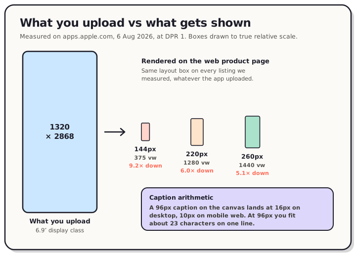
That number comes from measuring what the store does to your file. We opened App Store product pages this morning and measured the box your screenshot lands in. On a 1280-pixel desktop window it's 220 CSS pixels wide. On a 375-pixel phone window it's 144. You upload 1320 pixels and the page shows 220, so everything you drew gets divided by six before anyone reads it.
Read the chart description
Measured on apps.apple.com on 6 August 2026 at a device pixel ratio of 1. A 6.9-inch screenshot is uploaded at 1320 by 2868 pixels. On the App Store web product page it renders 144 CSS pixels wide at a 375 pixel mobile viewport, a 9.2 times linear reduction; 220 pixels wide at a 1280 pixel desktop viewport, a 6 times reduction; and 260 pixels wide at a 1440 pixel viewport, a 5.1 times reduction. The rendered boxes are drawn here to true relative scale against the upload. Apple's own sizes attribute requests a narrower image than the box it fills: 157 pixels for the 220 pixel box and 230 pixels for the 260 pixel box.
What we measured
On 6 August 2026 we loaded App Store product pages at three window widths and read the rendered size of the screenshot elements directly, at a device pixel ratio of 1.
| Window width | Screenshot renders at | Reduction from 1320px |
|---|---|---|
| 375 px | 144 × 312 | 9.2× |
| 1280 px | 220 × 476 | 6.0× |
| 1440 px | 260 × 563 | 5.1× |
The box is Apple's, not yours. We checked Things 3, Facetune and Flow Free, three apps that uploaded different files at different sizes, and all three rendered at exactly 220 × 476.3 on a 1280-pixel window. Flow Free's asset is even named flow-en-1-1242x2688.png, so the upload was 1242 wide and the page still drew it at 220.
Nothing is cropped, which is worth saying because plenty of advice assumes otherwise. That 220 × 476.3 box is a 0.4619 ratio, and the files going into it are 0.4614 and 0.4621. The page scales your whole screenshot down and shows all of it, top and bottom included.
One oddity worth knowing if you repeat this. Apple's sizes attribute asks the browser for a 157-pixel-wide image to fill that 220-pixel box, and a 230-pixel image for the 260-pixel box. The page requests a picture smaller than the space it puts it in, then stretches it. So the real rendering is a little softer than the numbers suggest, which cuts against fine detail even harder.
What that does to type
Here's the same caption drawn at four sizes on a 1320-pixel canvas, then reduced to the two widths we measured. Nothing is simulated. Each strip was rendered at full canvas size and downscaled the way a browser downscales, then magnified so you can see the pixels that survive.
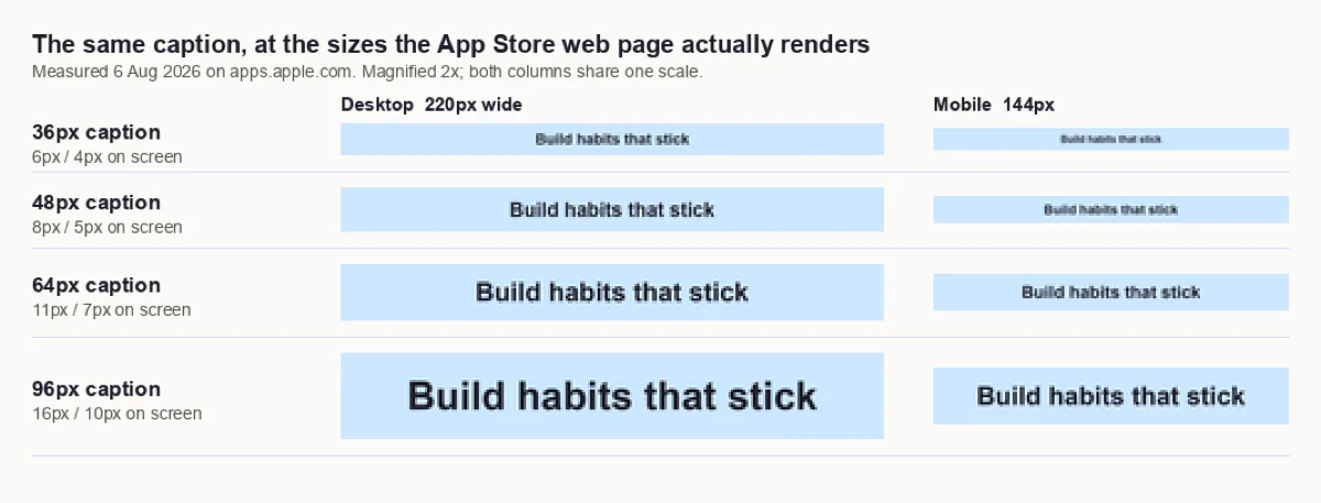
At 36 pixels the words are a grey smear. You can tell there's writing. You can't read it. At 64 the desktop column turns the corner and the mobile column doesn't. At 96 the desktop column is a normal 16-pixel line of text, the size this paragraph is probably rendering at for you.
So captions want to be big. They also want to be short, and those two pull against each other, because type gets wider as it gets taller.
The character budget
Your canvas, meanwhile, stays 1320 wide. Measuring a bold sans across it with 8% margins each side, which leaves 1109 usable pixels:
| Caption size | On screen (desktop / mobile) | Characters that fit |
|---|---|---|
| 48 px | 8 / 5 | 47 |
| 64 px | 11 / 7 | 35 |
| 80 px | 13 / 9 | 28 |
| 96 px | 16 / 10 | 23 |
| 128 px | 21 / 14 | 17 |
Read that as a budget rather than a target. "Track every habit in one tap" is 28 characters, so it just fits one line at 80 pixels and needs two lines at 96. "Build habits that stick" is 23, which is exactly the 96-pixel line. Once you know the trade you can pick deliberately instead of discovering it after export.
Two lines are fine, incidentally. Two lines of 96-pixel text read better than one line of 64, because legibility is set by the height of the letters and not by how many of them there are.
The rule that travels
The useful form of this isn't the pixel counts, it's the ratio. A caption that's a fourteenth of your canvas width renders at a fourteenth of whatever width the store decides to draw your screenshot at. That holds on a phone, on a desktop, in a search row, at any viewport, on either store.
So the portable version: caption height ≈ canvas width ÷ 14, and shrink the character count until the line fits.
On a 1320-pixel canvas that's 96 pixels. On the 1242-pixel 6.5-inch canvas it's 89. On Google Play's 1080-pixel phone screenshots it's 77. Every accepted canvas width is on our App Store screenshot sizes reference and the Google Play screenshot sizes reference.
It's worth putting next to the Play numbers we measured when we looked at what search actually shows. Play's listing page draws a 1080-pixel screenshot at 115 CSS pixels, a 9.4× reduction. Apple's web product page is gentler at 6× on desktop but lands in the same territory on a phone. Neither store shows anyone the file you exported.
What this doesn't prove
Three limits, stated plainly.
This is the App Store web product page, not the App Store app on an iPhone. Most installs happen in the app, and we can't tell you what size it draws screenshots at. The App Store app does ship inside the iOS simulator runtime, which surprised us, but it refuses to launch there: on an iPhone 17 Pro Max simulator running iOS 26.5 it fails with an open-application error every time. Measuring it on real hardware would mean signing into an Apple ID, which this routine doesn't do. Treat these numbers as one real surface, not every surface.
We didn't measure Apple's search card either, which is the same gap we flagged last time. Apple's web store has no public search results page at all: apps.apple.com/us/search returns a not-found page. The card exists in the app, where we can't get at it.
And a warning if you go measuring yourself. Apple's public search API returns a different screenshot set from the product page. For Facetune the API handed us a file named ...-5.5-01.jpg at 1242 × 2208 while the page was rendering ...-6.5-01.jpg. We nearly published a finding built on that before checking one against the other. The product page is the honest source for what a listing actually shows.
Writing the caption itself
The measurement decides the size. What goes in the words is a separate job, and a short one.
- One idea per screenshot. At 23 characters you get a claim, not a sentence. Pick the benefit, drop the qualifier.
- Front-load the noun. The first word or two is what survives a fast scroll. "Offline maps, always" beats "Always have your maps, even offline".
- Put it near the top. Not because the bottom gets cut off, since we just showed it doesn't on this surface, but because a 476-pixel-tall strip is scanned from the top down and the caption is the part that has to land first.
- Let image one be different. When we tore down ten top listings, seven treated the first screenshot differently from the rest, and two dropped the caption entirely. Image one says what the app is; the rest say what it does.
- Check it small. Export, then look at it at 220 pixels wide on your own screen. That's the honest preview, and it takes ten seconds.
Point five is the one that catches things. Every caption looks fine at 100% zoom in a design tool.
Frequently asked questions
How big should App Store screenshot text be? About a fourteenth of your canvas width. On a 1320-pixel canvas that's roughly 96 pixels, which renders at 16 pixels on the App Store's desktop web page. Below about 64 pixels the text stops being readable at display size.
How many words fit in a screenshot caption? At 96 pixels on a 1320-pixel canvas, about 23 characters on a line, which is three or four short words. Dropping to 80 pixels buys you 28 characters.
How small does the App Store display screenshots? On the web product page we measured 220 × 476 CSS pixels at a 1280-pixel window, 144 × 312 at 375 pixels, and 260 × 563 at 1440 pixels. That's a 6× to 9× linear reduction from a 1320-pixel upload.
Should captions go at the top or bottom of the screenshot? Near the top, though not for the reason usually given. On the App Store web product page we measured, screenshots are scaled whole and nothing is cropped. Top placement wins because it's read first, not because the bottom disappears.
Is one line better than two? Two lines of large text beat one line of small text. Legibility follows letter height, so keep the size and wrap rather than shrinking to fit one line.
Do captions need to be different per device size? The ratio stays the same, so a caption that works at 96 pixels on 1320 works at 89 on 1242. If you scale a set between canvas sizes, scale the type with it rather than keeping a fixed pixel value.
Designing at full size and reading at a fourteenth of it is the whole problem, and it's easier to solve if the preview is honest. In the QuickScreens editor captions scale with the canvas when you export a set to every required size, so the ratio holds from the 6.9-inch file down to the smallest one you have to ship. One-time $25, no subscription.