August 12, 2026 · 14 min read
3D device mockups: what a quarter-turn costs your screenshot
A 3D quarter-turn cuts the app UI to 56% of a flat frame in our own renderer. Measured numbers, plus what Apple publishes about tilting product images.
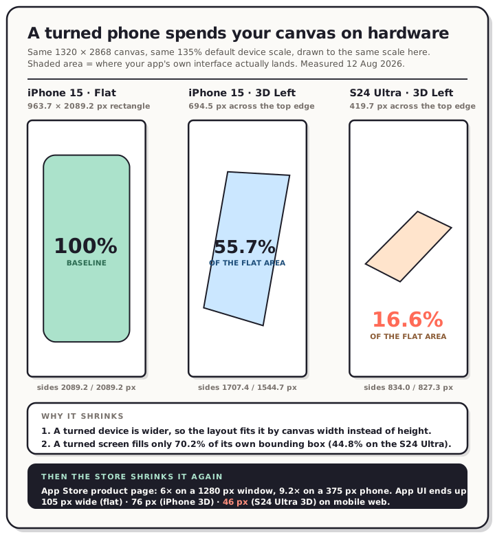
An angled phone looks better in a hero shot than a flat one. It also spends a large share of your canvas on hardware instead of your app. We measured how large: on our default canvas, switching an iPhone 15 from the flat frame to the 3D quarter-turn drops the app UI to 55.7% of the area it had. On a Galaxy S24 Ultra the same toggle drops it to 16.6%.
Those aren't estimates. They come from running our own layout code, the same code that produces the export, against the real device artwork. The method is at the bottom, and the numbers are reproducible.
Apple also publishes rules about tilting device images. Those rules are narrower than they first look, and the section below quotes them.
Read the chart description
Three 1320 by 2868 pixel store canvases drawn to the same scale, showing how much of each one the app's own interface occupies. All three are measured with the QuickScreens layout engine at its default 135 percent device scale. Panel one, iPhone 15 with the flat frame: the app screen is a 963.7 by 2089.2 pixel rectangle, taken as 100 percent. Panel two, iPhone 15 with the 3D Left quarter-turn: the app screen becomes a turned quadrilateral measuring 694.5 pixels across the top edge, with a near side of 1707.4 pixels and a far side of 1544.7 pixels, giving an area of 55.7 percent of the flat frame. Panel three, Galaxy S24 Ultra with the 3D Left quarter-turn: the app screen becomes a much smaller turned quadrilateral measuring 419.7 pixels across the top, with sides of 834 and 827.3 pixels, giving an area of just 16.6 percent of the flat frame. Two reasons are given: a turned device is wider, so it is fitted by canvas width instead of height, and a turned screen fills only 70.2 percent of its own bounding box on the iPhone and 44.8 percent on the Galaxy, measured from each artwork's alpha channel. A footer adds that the App Store product page then reduces the whole canvas a further six times on a 1280 pixel desktop window and 9.2 times on a 375 pixel phone window, so the app interface is finally drawn 105 pixels wide for the flat iPhone frame, 76 pixels for the iPhone quarter-turn and 46 pixels for the Galaxy quarter-turn on mobile web.
What a quarter-turn actually costs
Everything below is measured on a 1320 × 2868 canvas at the editor's default 135% device scale, which is what you get when you open a new project and pick a device.
| View | App screen, in canvas pixels | Area vs. flat |
|---|---|---|
| iPhone 15, flat | 963.7 × 2089.2 rectangle | 100% |
| iPhone 15, 3D Left | 694.5 across the top, sides of 1707.4 and 1544.7 | 55.7% |
| Galaxy S24 Ultra, flat | 972.8 × 2089.2 rectangle | 100% |
| Galaxy S24 Ultra, 3D Left | 419.7 across the top, sides of 834.0 and 827.3 | 16.6% |
Two things fall out of that table.
The first is the near/far gradient. A turned device has one edge closer to the camera than the other, so the two vertical sides of the screen aren't the same length. On the iPhone 15 pose they're 1707.4 and 1544.7 pixels, a ratio of 1.105. Content on the far side of the screen is drawn about 10% smaller than the same content on the near side. If your app's primary action sits on the right and you turn the phone left, that button is the thing being shrunk.
The second is that the two devices behave completely differently, for two reasons that compound.
Why it shrinks more than you'd guess
A flat phone frame is tall and narrow. A turned one is wider, because turning it swings the far edge out sideways. Our layout fits a device by height first and falls back to width when the height fit would push the artwork past the canvas edges. The flat iPhone 15 fits by height. The turned one is wide enough that it doesn't, so it fits by width instead and comes out smaller.
Then there's the shape itself. We measured this straight from the artwork's alpha channel rather than trusting the catalogue:
| Artwork | Screen aperture, in its own bounding box | Fill |
|---|---|---|
| iPhone 15, flat | 1179 × 2556 px | 97.9% |
| iPhone 15, quarter-left | 1476 × 2689 px | 70.2% |
| Galaxy S24 Ultra, flat | 940 × 2023 px | 99.8% |
| Galaxy S24 Ultra, quarter-left | 2192 × 1792 px | 44.8% |
A flat screen is a rectangle, so it fills nearly all of its bounding box. A turned screen is a tilted quadrilateral, and the box around it is mostly empty. The S24 Ultra's quarter-turn is the strongest angle in our catalogue, and its screen occupies less than half the box the layout is fitting. Fit the box, and you've fitted a lot of nothing.
(The flat iPhone 15 aperture measuring exactly 1179 × 2556 is a good sanity check on all of this: that's the iPhone 15's native panel resolution, arrived at independently by flood-filling the transparent region of the PNG.)
The fix, and where it runs out
Turn the scale up. Our scale control runs from 25% to 300%, and the arithmetic says:
- iPhone 15, 3D Left: 181% restores the screen area you had flat.
- Galaxy S24 Ultra, 3D Left: parity isn't reachable. At the 300% maximum it still only gets back to 82.2% of the flat area.
That second line is a limitation of our own tool and we'd rather say it than not. If you want a strong quarter-turn on the S24 Ultra and you also want the app UI at full size, our editor can't currently give you both. Scale it up as far as it goes, or use the milder tilt control described below.
Scaling up also means the device runs off the canvas edges, which is what you want anyway. When we read ten top-charting App Store listings, every framed set in the sample cropped the device at the canvas edge instead of fitting the whole phone inside. Fitting the whole device inside the canvas is what makes the screen small in the first place.
Then the store shrinks it again
The canvas numbers above are only half the reduction. We measured the box the App Store draws your screenshot in: 220 CSS pixels wide on a 1280-pixel desktop window, 144 on a 375-pixel phone. That's a 6× reduction on desktop and 9.2× on mobile web, applied to your whole 1320-pixel canvas.
Stack the two reductions and here's how wide your app's interface actually gets drawn on the product page:
| 375 px window | 1280 px window | 1440 px window | |
|---|---|---|---|
| iPhone 15, flat | 105 px | 161 px | 190 px |
| iPhone 15, 3D Left | 76 px | 116 px | 137 px |
| Galaxy S24 Ultra, 3D Left | 46 px | 70 px | 83 px |
Forty-six pixels is the entire width of your app's interface, on a phone, in the place where most people will see it. Nothing in your UI survives that except large shapes and strong color.
One more number to hold against those. Apple's own marketing guidelines set a floor for how small a device image should ever appear: "Ensure that the minimum device size is no smaller than 25 mm in height for printed materials and 200 px onscreen." At our default the iPhone 15 body lands around 249 CSS pixels tall on mobile web when flat and 212 when turned. Both clear the floor, but not by much, and anything that shrinks the device further puts you under it. Worth knowing that Apple picked a number at all.
The gentler version: the tilt slider
A baked quarter-turn is one fixed camera angle. The tilt control is a different mechanism, a live perspective transform that runs from -60° to +60° on each axis, and it's far less expensive because you choose the angle. Same iPhone 15 flat frame, same canvas, tilted about the vertical axis:
| Tilt | Near / far edge | Gradient | Top edge | Screen area |
|---|---|---|---|---|
| 0° | 2089 / 2089 | 1.000 | 100% | 100% |
| 10° | 2137 / 2044 | 1.046 | 98.6% | 98.6% |
| 20° | 2185 / 2002 | 1.092 | 94.6% | 94.3% |
| 30° | 2232 / 1963 | 1.137 | 88.1% | 87.3% |
| 40° | 2277 / 1930 | 1.180 | 79.2% | 77.7% |
| 60° | 2350 / 1881 | 1.250 | 56.2% | 51.3% |
Ten degrees is nearly free and still reads as dimensional. Twenty costs about 6% of the screen area. The cliff is past 40°, where you've given up a fifth of your canvas and the far edge is 18% smaller than the near one.
If you want depth without paying for it, 10° to 20° is the range. That's a suggestion from the arithmetic, not from conversion data, and we don't have conversion data on this.
What Apple actually publishes about tilting
Apple's Marketing Resources and Identity Guidelines govern how you use Apple's own product images. We read the page on 12 August 2026, and this is the sentence that matters:
Use Apple product images "as is" and without modification. Modifications include adding reflections, shadows, highlights, or graphic elements that appear to enter or come out of the product screen; cropping, tilting, or obstructing any part of the images; animating, flipping, or spinning the images; or creating buttons or icons with a product image.
Cropping and tilting are both standard screenshot practice, and both are named.
The same page has an "Unauthorized Uses" list that goes further:
Rendering in 3D or creating any simulation of an Apple product
Illustrations that depict an Apple product, except for instructional material
Graphics, illustrations, or logotypes to represent an Apple product
Further down, Apple describes what a generic device may look like, which is the practical way through:
If your marketing contains illustrations of generic devices, ensure that these devices do not include details that are unique to Apple products, such as the iPhone Home button, sensor housing, Ring/Silent switch, or volume controls.
Read the scope carefully before you panic. That page is about Apple-provided product images in marketing communications. It tells you what to do with the bezel files Apple hands you, and it says to use Apple's own bezels in marketing materials rather than drawing your own. It is not the App Store screenshot specification, and it does not say "a rejection follows." We have not tested an upload and we won't predict one, which is the same line we hold on every spec claim on this site.
What it does tell you is that the safest 3D mockup is a generic device with no Home button, no recognisable sensor housing, and no distinctive switch or volume buttons. That constraint has a primary source behind it and costs almost nothing to follow.
Two review guidelines are worth having alongside it. 2.3.3: "Screenshots should show the app in use, and not merely the title art, login page, or splash screen." A dramatic angled hero with the app reduced to a sliver is not obviously "the app in use," and that's a judgement call someone else gets to make. 2.3.10: don't "include names, icons, or imagery of other mobile platforms or alternative app marketplaces in your app or metadata." An Android device frame in an App Store screenshot is exactly that, so pick your mockup device to match the store you're uploading to.
What Google publishes about device frames
For phones and tablets, nothing. Google's graphic asset requirements cover dimensions, aspect ratio and format, and say nothing about whether a device frame may appear in a phone screenshot.
For Wear OS they're explicit, and it's a flat ban. Watch app and watch face listings must, in Google's own words, "Provide screenshots showing only the app interface" and "Not position the screenshots within device frames, or include additional text, graphics, or backgrounds that are not part of the interface of the app," at a 1:1 aspect ratio and at least 384 × 384 pixels.
So a device frame is fine on your phone listing and forbidden on your watch listing, in the same console on the same afternoon. If you're shipping a Wear OS app, that's the one to write down.
When a 3D mockup is worth it anyway
The angle earns its cost in a few specific places.
It's worth it when the screen isn't the message. A first screenshot that sells a promise rather than a feature can afford a small, angled device, because the headline is doing the work. That matches what we saw in the top listings: seven of the ten gave the first screenshot a different job from the rest of the set.
It's worth it when you're showing two devices. An angle lets a phone and a tablet overlap without either hiding the other, which is the one thing a flat frame genuinely can't do. Calm was doing exactly that when we read its listing on 31 July.
It's worth it for the hero image outside the store. Your website, your Product Hunt gallery, your launch tweet. None of those shrink your image to 144 pixels, and none of them apply Apple's screenshot spec.
It's rarely worth it for screenshots two through six. Those are the ones people swipe through to find out what the app does, and the app is what should be legible.
Frequently asked questions
Do 3D device mockups hurt App Store conversion? We don't know, and we're not going to invent a number. What we can measure is legibility, and a quarter-turn plus the store's own 6× to 9× reduction leaves the app UI between 46 and 137 CSS pixels wide depending on device and window. Judge from that rather than from a conversion claim nobody has published.
Is it against the rules to tilt an iPhone in my screenshots? Apple's marketing guidelines say to use Apple product images "as is" and list tilting as a modification. That governs Apple's own product image files in marketing communications, not third-party artwork in a store screenshot, and Apple doesn't publish a screenshot rule about angles. Our reading: use a generic device without Apple-specific details if you want an angle, and don't treat the guideline as a rejection prediction.
Can I use an Android phone mockup in App Store screenshots? Review guideline 2.3.10 says not to include "imagery of other mobile platforms" in your app or metadata. Match the mockup to the store.
Can I use device frames in Google Play screenshots? On phone and tablet listings, Google's asset requirements don't address it. On Wear OS listings they require screenshots "showing only the app interface" and say not to position them within device frames.
What tilt angle is safe? From the measurements above, 10° to 20° keeps 94% or more of your screen area and still reads as three-dimensional. Past 40° you're giving up a fifth of the canvas.
Why does the 3D view make my device smaller? A turned device is wider than a flat one, so it hits the canvas width limit before the height limit and gets scaled down to fit. Turn the device scale up to compensate. On our iPhone 15 quarter-turn, 181% restores the screen area of the flat frame.
What canvas size should I be designing on? 1320 × 2868 covers iPhone, since Apple scales it down for smaller display classes. The full list of accepted sizes has every option, and the Play equivalents are here.
Method
Geometry was computed by importing this site's production layout module (src/lib/render/layout.ts) and running it against the shipped device catalogue at a 1320 × 2868 canvas and the editor's default 135% device scale. That's the same function the canvas and the export both call, so the numbers describe real output rather than a model of it. Screen areas come from the shoelace formula on the projected quad; tilt figures come from the same pinhole projection the renderer uses.
Aperture dimensions and fill ratios were measured independently, by flood-filling the transparent region in each bezel PNG's alpha channel. That method returned 1179 × 2556 for the flat iPhone 15, which is the device's native panel resolution, and agreed with the catalogue quads within about 3%.
Store render sizes are from our own measurement of App Store product pages on 6 August 2026. Apple's Marketing Resources and Identity Guidelines and App Review Guidelines were read on 12 August 2026; Google's graphic asset requirements the same day. No upload was tested, so every store claim here is about published specifications, not about what an uploader enforces.
If you want the angle without doing this arithmetic, the QuickScreens editor has both: flat frames, baked 3D quarter-turns on the devices whose artwork includes them, and a tilt control for everything else, all rendering identically in the preview and the export. One-time $25, no subscription.