July 30, 2026 · 15 min read
The Google Play feature graphic, explained
Two hard requirements, then the part nobody measures. We checked 150 Play listings: where the 1024×500 graphic appears, and how much of it gets cut.
Google Play has exactly two hard requirements for the feature graphic: it must be 1024 × 500 pixels, and it must be a JPEG or a 24-bit PNG with no alpha channel. You can't publish a store listing without one.
Everything else Google publishes about the asset sits under a heading called "highly recommended", which reads like polish and isn't. Google is explicit that breaking those guidelines won't hurt your listing page, but it can change how your assets appear elsewhere on Play or limit your promotional opportunities. The requirements decide whether you ship. The recommendations decide whether Google ever puts your app in front of someone who wasn't already looking for it.
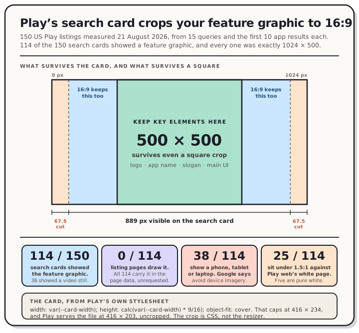
So we went and measured the surface where that happens. On 21 August 2026 we pulled 150 US Play listings, 15 search queries with the first 10 app results each. 114 of those 150 search cards showed a feature graphic, and every single one was exactly 1024 × 500. The other 36 showed a still from the app's preview video instead. Then we read Play's own stylesheet to find out what it does with the file, and the answer is the useful part of this post: the card crops it to 16:9 and throws away 67.5 pixels from each side.
Read the chart description
A 1024 by 500 pixel feature graphic drawn to scale with two nested regions marked on it, from 150 United States Google Play listings measured on 21 August 2026 across 15 search queries taking the first 10 app results each. Google Play's own stylesheet sizes the search card as width equals card width and height equals card width times 9 divided by 16, with object-fit cover, so the 2.048 to 1 graphic is cropped to 16 by 9. The middle 889 pixels survive and 67.5 pixels are trimmed from each side. Inside that, the centre 500 by 500 square is the region that would survive even a square crop, and it is where brand logo, app name, slogan and main UI belong. Four measured figures: 114 of the 150 search cards showed the feature graphic while 36 showed a YouTube video thumbnail; 0 of 114 listing pages requested the feature graphic as an image, although all 114 carried it in the page data; 38 of 114 show a phone, tablet or laptop even though Google's guidance says to avoid device imagery; and 25 of 114 sit below 1.5 to 1 contrast against the Play web store's rgb(255,255,255) background. A footer records the card CSS: card width caps at 416 pixels so the box is 416 by 234, while Play serves the image file itself at 416 by 203, uncropped, with an 8 pixel corner radius and a drop shadow.
It is not on your listing page
If you picture the feature graphic as a banner across the top of your store listing, it isn't one, and we can put a number on that. We fetched all 114 listing pages for the apps whose search cards used one. Zero of them requested the feature graphic as an image. All 114 carry it in the page's data payload, so Play clearly knows about it there, but nothing on the page ever asks for the file, and none of them use it as the og:image either.
That matches what Google actually says. The uses it lists are:
- The cover image for your preview video, if you have one. Spatial Android XR videos are the exception.
- Large-format app collections, including ads.
- Large-format game groupings, where recommended games are shown with preview videos and screenshots.
Note that the search card isn't on that list. Google's page says the graphic "is displayed in various places on Google Play, including" those three, and the card we measured is one of the places it doesn't name.
That makes the design brief a tile: small, next to other apps, seen by people who have never heard of you. Whether your card shows the graphic or a video still tracks the category: habit tracker and note taking came back 10 out of 10 on the graphic, while puzzle game went 3 out of 10 because games lean on video. If you have a preview video, the video wins the card and the graphic becomes its cover image.
Every one of the 329 card images across our 15 search pages carries alt="Screenshot image", including all the feature graphics. Play labels your graphic as a screenshot to screen readers. That's Play's markup, not yours, and there's nothing you can do about it from Play Console.
The crop, from Play's own stylesheet
Google's guidance says to keep key elements out of the "cutoff zones" and ships a diagram with red bands on it, but publishes no pixel numbers. For this one surface you don't need them, because the rule is in the CSS Play serves:
width: var(--card-width);
height: calc(var(--card-width) * 9/16);
object-fit: cover;
--card-width is responsive and caps at 416px, so the widest card box is 416 × 234. Your graphic is 1024 × 500, which is 2.048:1. The box is 1.778:1. With object-fit: cover the browser scales your image until it fills the box and clips the overflow, and because the graphic is wider than the box, the overflow is horizontal.
The arithmetic falls out of that. The visible slice is 1024 × (16/9) ÷ 2.048, which is 889 pixels, centred. That leaves 67.5 pixels trimmed from each side, or 13.2% of your canvas gone. The crop is a ratio, so it doesn't change with viewport: at the mobile breakpoint the card is calc(100vw - 48px) wide, which is 327px on a 375-wide screen, still 16:9, still the same middle 889 pixels.
Two details. First, the crop is not the resizer's doing. Play requests the image at =w416-h235-rw and gets back 416 × 203, the whole frame scaled, uncropped, at the original 2.048:1. We checked all 114 and every one came back that way. The clipping happens afterwards, in CSS. Second, a 203-tall file going into a 234-tall box means the browser scales it up about 15% before it crops, so the card is showing your artwork slightly soft as well as slightly narrow.
Play also draws the card with an 8px corner radius and a real drop shadow (rgba(60,64,67,.3) 0 1px 2px plus rgba(60,64,67,.15) 0 1px 3px 1px), which is the same treatment Play gives the screenshot thumbnails we measured on the search card.
Design for the square anyway
889 pixels is the number for the surface we could measure. It is not the number for the surfaces we couldn't, and those are the ones Google is warning you about: the app collections and game groupings, some of which "may use additional UI overlays", in formats Google controls and doesn't document.
Centre-crop a 1024 × 500 canvas to the common shapes and you get:
| Crop | Keeps (centred) | Trims per side |
|---|---|---|
| 16:9 (measured on the search card) | 889 px | 67.5 px |
| 4:3 | 667 px | 179 px |
| 1:1 | 500 px | 262 px |
The last row is the conservative floor. The centre 500 × 500 square is the only region that survives a square crop, so put your logo, app name and one-line hook in the middle half of the canvas and let the outer bands carry background only. Google says the same thing in its own words: restrict background elements to the edges of the graphic.
Real listings half-follow that. We measured detail density across each graphic, counting pixels where the image changes sharply and comparing what falls inside the centre square against what falls outside. The outer bands are 51.2% of the canvas by area, and they carry a median of 42.3% of a graphic's detail, so there's a real centre bias. But 27 of the 114 put more than half their detail outside the centre square, and 6 put none there at all. Calm, Duolingo and Google Fit are in that second group, each a wordmark dead centre with flat colour to the edges. Those three survive any crop.
The two things that are actually required
| Requirement | Value |
|---|---|
| Dimensions | 1024 × 500 px, exactly |
| Format | JPEG or 24-bit PNG, no alpha channel |
The alpha rule is the one that bites on export. A 32-bit PNG is the default in a lot of design tools and it's the wrong file here, the same trap that bites simulator captures on the Apple side and adb screencap on Android. Flatten it onto a real background before you upload.
Note what isn't on that list: a maximum file size. Google publishes one for the app icon (1024 KB) and doesn't publish one for the feature graphic. Keep it sensible anyway, since a 1024 × 500 canvas has no business being large.
An aside on that alpha rule, because our data has something odd in it. Of the 114 graphics we pulled at full size, Play served 76 as PNG and 38 as JPEG, and one of those PNGs, LastPass, carries 133,377 fully transparent pixels, just over a quarter of the canvas. Five others have partially transparent pixels. We can't tell you what those developers uploaded, because what you fetch from Play is Google's own re-encode and not the original file, so treat this as a curiosity rather than a loophole. Upload a flattened image and the question never comes up.
For the rest of the Play asset spec, sizes, counts and per-device rules, we keep a verified reference at Google Play screenshot sizes & requirements, and the tablet and Chromebook rules have their own post.
Colour, and why white backgrounds disappear
Google specifically warns against pure white, black and dark grey, "as these colors can easily blend in with Google Play's background". Play web has one background and it doesn't change: rgb(255, 255, 255), in dark mode too.
So we scored all 114. Taking the outer 3% of each graphic as its canvas, the same definition we used for dark versus light screenshot backgrounds, the median lands at L* 56.4 with a wide spread: 12 near-black, 24 in the top band above L* 85, and the rest scattered between. Against Play's white page, 25 of the 114 sit below 1.5:1 and 16 fall below 1.2:1. Those two thresholds are ours, not Google's, and below them the card's drop shadow is doing all the work of telling the reader where your artwork stops.
Five are exactly rgb(255, 255, 255) at the edge, a flat 1:1 against the page. Two of those five are Google Fit and Google Password Manager, which are Google's own apps sitting on the colour Google's own guidance names first.
The rest of Google's colour advice is to go more vibrant than feels natural, and to keep the colour theme consistent across the feature graphic, the icon and the app itself so people connect them at a glance. Saturated brand colour with high-contrast type is the safe shape.
One trap. Play stores its own extracted colour alongside your graphic in the listing page data. It tracks the real canvas better than Apple's equivalent field does, with a median difference of under 3 L*, but 10 of our 114 are more than 20 L* off and 2 flip from dark to light entirely. Don't audit your set with it.
What Google tells you to leave out
Most of this is policy language you'd expect. One item contradicts the advice for screenshots.
Ranking, price and promo claims. No content suggesting Play performance, ranking, testimonials, awards or pricing. Google names the words it means: Best, #1, Top, New, Free, Discount, Sale, Million Downloads. The same rule governs your short description, so a claim you can't make in the graphic is one you can't make in the copy either.
Store badges. No Google Play badge or icon, and none from any other store.
Third-party trademarks. No characters or logos you don't have permission to use.
Device imagery. Google lists device imagery as something to avoid, because it dates quickly and can alienate users on other hardware. That's the opposite of the advice for screenshots, where a device frame is standard and helps.
We counted that one. Going through all 114 graphics by eye, looking for a phone, tablet, laptop or monitor with a visible bezel, 38 of them have one. A third of the top listings in these categories do the thing Google's guidance names, and it clusters by category: weather apps went 6 of 8 and budget apps 6 of 9, while recipe apps went 0 of 6 and note-taking apps 1 of 10.
There's a second cost to the frames, and it shows up in the detail measurement above. Graphics with a device in them put an average of 44.5% of their detail outside the centre square, against 36.7% for the ones without. A phone mockup is tall, so it gets pushed to one side, and the side is exactly what the card cuts.
We sell device frames, so let's be blunt about which way we'd read that. The count says the guidance is widely ignored. It doesn't say ignoring it is free. What you lose is eligibility for promotional formats, and Google states plainly that missing a "highly recommended" guideline won't touch your listing page, so nothing ever tells you it happened. Frames belong in your screenshots, where they help and where nothing tells you not to. In the feature graphic, put your artwork and your value proposition instead.
We also found two graphics carrying a Play badge outright while doing that pass, one with "GET IT ON Google Play" and one with a Play-triangle "Editors' Choice" banner. We weren't counting badges systematically, so treat two as a floor rather than a total.
Time-sensitive content. Anything that goes stale creates maintenance. If you run seasonal artwork, Google expects you to swap it out on schedule rather than leave a holiday graphic up in March.
The permission you already granted
Two more things from the same Google help page.
The first: by publishing on Play you grant Google a licence to use your app's assets, including your icon, screenshots and videos, for promotional purposes across the Play Store, promotional campaigns and other Google services. That's in the Developer Distribution Agreement, and it's the mechanism behind every "large-format collection" your feature graphic might land in.
The second: you can turn it down. Unchecking the External marketing box under Grow users, then Store presence, then Store settings restricts the promotion of your app across Google-owned properties. Most people should leave it on, since it's free distribution. The switch matters if your artwork is licensed in a way that makes wider use a problem.
One more, for anyone testing: assets show on your store listing across all test tracks as soon as you add them.
The alt text nobody writes
Google asks for alt text on each graphic asset, for screen-reader users. The tips are specific: skip "photo of" or "image of" because screen readers already announce that, and describe the important part of the image in 140 characters or fewer. Google's own example is "The transaction complete screen."
It takes ten seconds, and it's the one item in this post we couldn't measure: alt text isn't exposed on the public listing, so we have no idea how many people bother. If you want the rest of the pre-launch details in one place, we keep a pre-launch listing checklist.
Making one without opening a design tool
The feature graphic is a different artifact from your screenshots, but it shouldn't be a different project. It's the same brand, the same type, the same palette, at a much wider aspect ratio. Google asks for that consistency directly, and separately asks you to avoid duplicating the same message across your short description, screenshots and feature graphic, since those assets can appear side by side.
The QuickScreens editor ships a 1024 × 500 feature graphic preset next to the Play and App Store screenshot sizes, so you can build the whole set in one place and export it together. The canvas is locked to the right dimensions.
One practical tip that applies wherever you build it: export the feature graphic as JPEG rather than PNG. JPEG has no alpha channel to carry, so the format rules itself out of the problem. Our exporter also lays the artwork on a white underlay before encoding a JPEG, so a transparent background can't quietly turn into black pixels.
Frequently asked questions
Is the Google Play feature graphic required? Yes. Google's wording is that you must provide one to publish your store listing. It isn't optional artwork, even if your app has no preview video.
What size is the Google Play feature graphic? 1024 × 500 pixels, exactly, as a JPEG or 24-bit PNG with no alpha channel. Those are the only two hard requirements Google lists for the asset. Every one of the 114 live graphics we measured was exactly that size.
Where does the feature graphic appear? Google names three places: as the cover image for your preview video, and in the large-format app collections and game groupings it uses to merchandise, including ads. We measured a fourth that Google doesn't name, the Play web search card, which showed it on 114 of 150 listings. It does not appear on your own listing page.
Why does my feature graphic look cropped?
Because it is. On the Play web search card the image sits in a 16:9 box with object-fit: cover, so the middle 889 of your 1024 pixels are shown and 67.5 pixels are cut from each side. Other formats crop differently and Google doesn't publish their shapes, which is why the centre 500 × 500 square is the safe place for anything that has to be read.
Can I put my app screenshots in the feature graphic? You can show your main UI, but keep it centred and large enough to read at card size, which is 416 CSS pixels wide at most. Skip the phone frame around it: Google lists device imagery as something to avoid on this asset, even though 38 of the 114 listings we measured include one anyway.
Does the feature graphic need to be localized? If your listing is localized, yes. Google asks you to localize the graphic and any branding text in it for each market, which is a good reason to keep the text short. We looked at what localizing store artwork actually costs separately.
Building your Play listing this week? Open the editor, and export your screenshots and the 1024 × 500 feature graphic from one project. One-time $25, no subscription.