August 20, 2026 · 13 min read
Dark or light: picking a screenshot background
We measured the first screenshot of 100 top App Store listings. 49 dark canvases, 51 light. The split is even, so here's the thing that actually decides it.
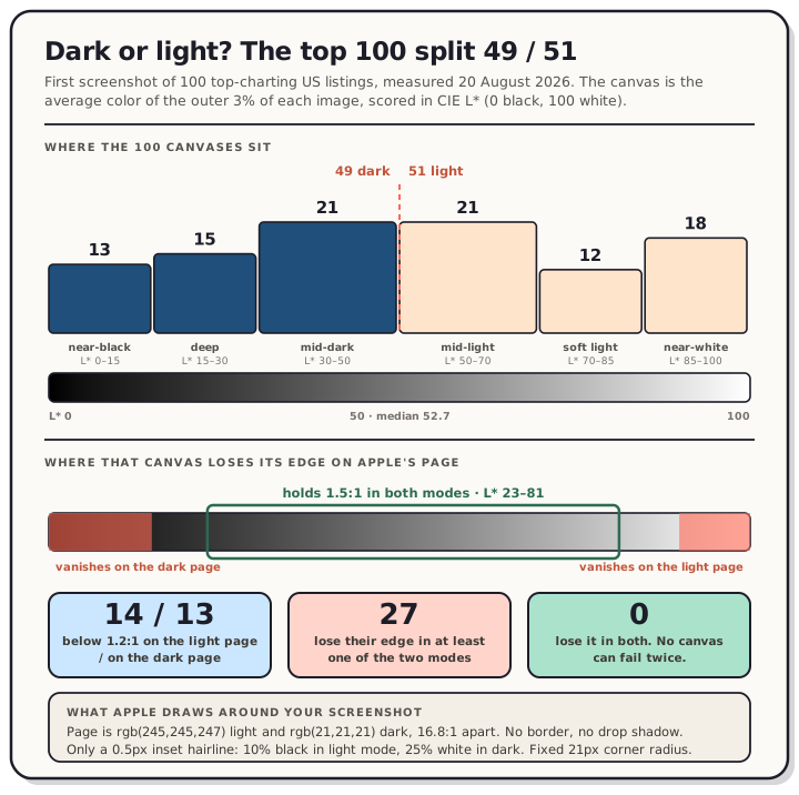
We measured the first screenshot of 100 top-charting US listings on 20 August 2026. Forty-nine sit on a dark canvas, fifty-one on a light one. Apps split 25/25 and games split 24/26. There is no convention here to copy, and anyone telling you dark converts better is guessing, because neither store publishes that data and we didn't run a test.
So pick on something you can actually check. Your canvas has to survive the page it lands on, and on the App Store that page comes in two colors. We measured those too: light mode is rgb(245, 245, 247), dark mode is rgb(21, 21, 21). Twenty-seven of the hundred listings we measured have a canvas that dissolves into one of them.
Read the chart description
Panel one, the canvas tone of the first screenshot on 100 top-charting United States App Store listings, measured 20 August 2026 as the average color of the outer three percent of each image and scored in CIE L star, where 0 is black, 100 is white and 50 is the perceptual midpoint. The split is 49 dark and 51 light, median L star 52.7. By band: 13 listings near-black at L star 0 to 15, 15 deep at 15 to 30, 21 mid-dark at 30 to 50, 21 mid-light at 50 to 70, 12 soft light at 70 to 85, and 18 near-white at 85 to 100. Panel two, edge contrast against Apple's product page, which is rgb(245,245,247) in light mode and rgb(21,21,21) in dark mode, 16.8 to 1 apart. A canvas darker than about L star 15 falls below 1.2 to 1 against the dark page, and a canvas lighter than about L star 90 falls below 1.2 to 1 against the light page. Between L star 23 and 81 a canvas holds at least 1.5 to 1 in both modes. Of the 100 listings, 14 fall below 1.2 to 1 on the light page, 13 fall below on the dark page, 27 fail in at least one mode, and none fail in both. Apple draws no border and no drop shadow, only a half-pixel inset hairline at 10 percent opacity in light mode and 25 percent in dark.
How we measured it
The sample is Apple's US Top Free Apps marketing feed (50 listings) plus the legacy US Top Free Games RSS feed (50), giving 100 unique app IDs, the same construction we used for how often listings ship a version. Screenshot URLs came out of each product page's serialized-server-data, from the product_media_phone_ shelf. All 100 resolved.
For each first screenshot we took the outer 3% border of the image and averaged it. That ring is the canvas: on a framed screenshot it's the background behind the device, and on a full-bleed one it's whatever your app draws at the edges. Then we scored it in CIE L*, where 0 is black, 100 is white, and 50 is the perceptual midpoint. Splitting at 50 is the only threshold in this post that isn't arithmetic, and it's ours, not a store rule.
Two things that measurement is not. It isn't a read of the whole image, and it isn't a claim about installs.
Your canvas is not your screenshot
Sixteen of the hundred change category depending on which one you measure. Threads has a canvas at L* 11, about as dark as it gets, but the whole image averages 56 because the app UI inside the frame is light. Claude does the same thing: a dark photographic canvas at L* 18 wrapped around a bright chat card, averaging 62 overall. Google Gemini runs it backwards, with a pure white canvas at L* 100 around a black device showing a dark-mode interface, averaging 52.
That's worth naming because "dark screenshots" and "a dark canvas" are separate decisions. Gemini's screenshot is mostly dark pixels sitting on a white background. Claude's is mostly light pixels sitting on a dark one. Both are top-50 apps and they chose opposite answers to both questions.
Only 27 of the hundred use a flat canvas, which we defined as under 2 L* of spread across four corner patches. The median spread is 13.7 L*, and 60 listings are above 10, meaning gradients, photographs, or full-bleed app UI. Picking "a background color" is already the minority approach.
Within a set, though, people are consistent: 83 of the hundred keep the same dark or light category across their first three screenshots.
What the App Store actually draws around it
We measured Apple's product page on 20 August 2026 at a 1280-wide viewport and again at 375. The findings are the same at both.
The page background is rgb(245, 245, 247) in light mode and rgb(21, 21, 21) in dark. Those two are 16.8:1 apart, so your screenshot is being asked to work against near-white and near-black without you choosing which.
Your screenshot gets a fixed 21px corner radius with overflow: hidden. Fixed, not proportional. The slot is 220 CSS px wide on desktop, so the radius eats 9.5% of the width; at a 375 viewport the slot is 144 px and the same 21px radius is 14.6%. Corners get clipped harder on phones, which is where most people are looking. (Those slot sizes, 220 × 476.3 and 144 × 311.8, match what we measured for caption legibility on 6 August, so the layout has not moved in two weeks.)
There's no border and no drop shadow. What there is, and we nearly missed it, is a hairline drawn by an ::after pseudo-element: a 0.5px inset shadow on all four sides, rgb(0, 0, 0) at opacity 0.1 in light mode and rgb(255, 255, 255) at opacity 0.25 in dark.
That hairline is not symmetric, and the asymmetry is the practical part. Composite it and do the contrast arithmetic:
| canvas alone vs page | with Apple's hairline | |
|---|---|---|
| White canvas on the light page | 1.09:1 | 1.15:1 |
| Near-black canvas on the dark page | 1.08:1 | 2.49:1 |
In dark mode the hint works. In light mode it does essentially nothing, because 10% black over white lands at rgb(230, 230, 230) against a rgb(245, 245, 247) page. A white canvas on the App Store's light page has no edge, and Apple's separator won't give you one.
Twenty-seven listings lose an edge
Running every measured canvas against both page colors:
- Median contrast is 3.74:1 on the light page and 4.49:1 on the dark page.
- 14 of 100 fall below 1.2:1 against the light page. Gmail, Chrome, Maps, Gemini, Google, Meta AI, ClassDojo and Whatnot are all in there, several of them at rgb(255, 255, 255) exactly.
- 13 of 100 fall below 1.2:1 against the dark page: Triumph Arcade, X, Roblox, 8 Ball Pool, TikTok Pro, Grok, Threads and others, every one of them below rgb(30, 30, 40).
- Zero fail in both modes. 27 fail in at least one.
That last pair is the whole mechanism. A canvas can't be too light for the light page and too dark for the dark page at once, so every extreme choice is a bet that your visitors are in the mode that flatters it. The 1.2:1 line is ours, chosen as "the edge is effectively gone"; nothing about it is official.
Sixty listings hold at least 1.5:1 in both modes, and every one of those sixty falls in an L* band of 22.7 to 80.7. We then checked that against pure arithmetic, running a neutral gray ramp and asking which grays clear 1.5:1 against both page colors. The answer is rgb 54 to rgb 202, which is L* 22.6 to 81.3. The two bands agree to within a point, which is a good sign the measurement is reading what we think it is. And because contrast depends only on luminance, that band holds whatever hue you pick: a saturated teal at L* 50 clears the same bar a mid-gray does.
If you want the stricter WCAG non-text contrast level of 3:1 in both modes, the band collapses to L* 42 to 59, or roughly rgb 99 to 142. Only 21 of the hundred manage it. That's a narrow strip of mid-gray and mid-tone color, and it's a real cost, so treat 3:1 as a nice-to-have on a decorative edge rather than an obligation.
Play is a different problem
Google Play's web store doesn't have two modes. We measured the Spotify listing on 20 August 2026 with prefers-color-scheme set to dark, and the page background stayed rgb(255, 255, 255). One background to design against, and it's white.
Play also does what Apple doesn't: it draws your screenshot as a card, with an 8px radius and a real external drop shadow (rgba(60, 64, 67, 0.3) 0 1px 2px, plus rgba(60, 64, 67, 0.15) 0 1px 3px 1px). A white canvas on Play still reads as an object, because the shadow defines the edge that the canvas doesn't.
Two limits on that. This is the Play web store and not the Play app on a device, the same boundary we hit when we measured the search card; the app has its own theming we haven't measured. And on Play, per that same teardown, the image search actually shows you is usually the feature graphic rather than a screenshot at all. Which is where Google's own advice comes in.
What the stores say, and don't
Google says the quiet part out loud, in the feature graphic section of its preview assets page: "Avoid using pure white, black, or dark gray as these colors can easily blend in with Google Play's background." A few lines earlier it says the same thing again, recommending "more vibrant colors" and warning that pure white or dark gray "can blend in with the Play Store background."
Note where that guidance sits. It's under Feature graphic, not under Screenshots. Google's screenshot requirements cover format and dimensions (JPEG or 24-bit PNG, no alpha, 320px to 3,840px, long side no more than twice the short side) and say nothing about background color. So if you're following that advice, follow it on the 1024 × 500 feature graphic first, since that's the asset it's written for and the one Play search leans on.
Apple publishes nothing equivalent. We searched the raw HTML of both the screenshot specifications page and the product page guide on 20 August 2026: zero occurrences of "background", "contrast", "white", "black" or "blend". The specs page tells you the formats (.jpeg, .jpg, .png) and that "Images can't include alpha channels or transparencies", and stops there. Full accepted dimensions are on our App Store screenshot sizes page.
Apple's one dark-related sentence is about your app, not your canvas: "If your app supports Dark Mode, consider including at least one screenshot that showcases what the experience looks like for users."
One store does forbid a canvas outright. For Wear OS, Google requires that you "not position the screenshots within device frames, or include additional text, graphics, or backgrounds that are not part of the interface of the app", and adds "Don't include transparent backgrounds or masking." On watches there's no canvas decision to make.
Apple's own background color is not your canvas
Every screenshot in that page data ships with a backgroundColor and a textColor that Apple extracted from your image. All 100 listings had one. It's tempting to treat it as Apple's read of your canvas, and it isn't.
Compared against our measured border ring, the median difference is 7.3 L*, but 24 of the 100 are off by more than 20 L*, and 15 disagree about whether the screenshot is dark or light at all. Claude is the extreme case: Apple publishes rgb(233, 232, 228), an almost-white color, for a screenshot whose canvas measures rgb(52, 42, 34). Apple picked the bright chat card in the middle. Candy Crush Saga gets rgb(208, 130, 24) against a measured canvas of rgb(57, 45, 92).
Whatever that value is for, it's a salient color pulled from somewhere inside the artwork, not the color at the edges. Don't use it to audit your own set.
So what should you pick
Nothing here says dark or light. It says the extremes cost you something specific and the middle doesn't.
- If your canvas sits between about L* 23 and L* 81, its edge survives both of Apple's page modes at 1.5:1, and it'll read as a card on Play's white page too. Sixty of the hundred listings we measured are already in that band.
- If you want pure white, know that you're giving up the edge on Apple's light page and leaning on Play's drop shadow. That's a real choice several very large apps have made deliberately.
- If you want near-black, Apple's dark-mode hairline does more for you than the light-mode one would (2.49:1 on the Threads canvas we composited), but you're the one who blends into Google's white page, which is exactly what Google's feature-graphic advice warns about.
- Keep 21px of corner radius clear of anything load-bearing, and remember that's 14.6% of the rendered width on mobile web.
- Pick one and hold it. Consistency across the set is what 83 of the hundred do.
FAQ
Does a dark or light background get more installs? Nobody outside Apple and Google can answer that. Neither store publishes conversion data by screenshot style, we ran no controlled test, and the even 49/51 split means the market hasn't settled it either. Anyone quoting a lift percentage is inventing it.
Will my screenshot get rejected for the wrong background color? Neither store publishes a background-color rule for screenshots, so there's nothing to fail. The rules that do exist are about format and size: no alpha channel on either store, and Play's dimension limits. We haven't tested uploading anything non-compliant, so we can't tell you what happens if you try.
Does the App Store really round my screenshot's corners?
Yes, on the web product page. We measured a fixed 21px border-radius with overflow: hidden on the container at both 1280 and 375 viewports on 20 August 2026. It's the web store we measured, not the App Store app on a device.
Should I match my screenshot background to my app's dark mode? Apple suggests showing your app's dark mode in at least one screenshot if you support it, which is about the UI inside the frame. The canvas around it is a separate decision, and Gemini and Claude are the proof: a dark app UI on a white canvas and a light app UI on a dark canvas, both shipping in the top 50.
What about the feature graphic on Play? That's where Google's actual color advice lives, and it's the asset Play's web search card tends to show. Avoid pure white, black and dark gray there specifically.
Testing a canvas is faster than arguing about one. Open the editor, drop in a capture, and flip the background between a light tone and a dark one to see which holds its edge. Exports come out at every accepted size for both stores, and the L* band above is a decent sanity check before you upload.